Create a global identity.
Support France TV's digital transformation by creating a strong, consistent, and modular visual identity.
Faced with the growing power of streaming giants such as Netflix, Disney+, Prime Video, or YouTube, France TV needed to modernize its image to remain attractive and competitive.
Lead the art direction and establish the foundations of the digital visual identity, design the guidelines, and collaborate with internal teams to ensure a consistent application across all platforms.
Conversion
> Increase the revenue growth rate by 5%
Attraction
> Increase the global engagement rate
Retention
> Increase the rate
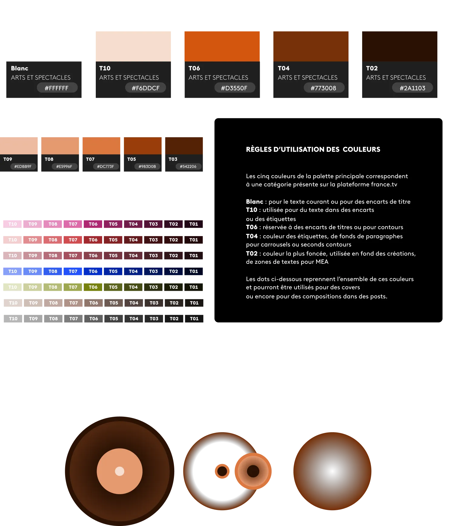
1. Design a visual language based on the multidot—the group's iconic symbol—to create a clear, distinctive, and memorable system. 2. Deploy immersive and narrative spaces to highlight the platform's key moments. 3. Formalize a shared art direction and communicate it to internal teams through workshops and guidelines. 4. Adapt the design to the specifics of each medium (product, design system, social media, newsletter...) to ensure consistency and impact across all levels.
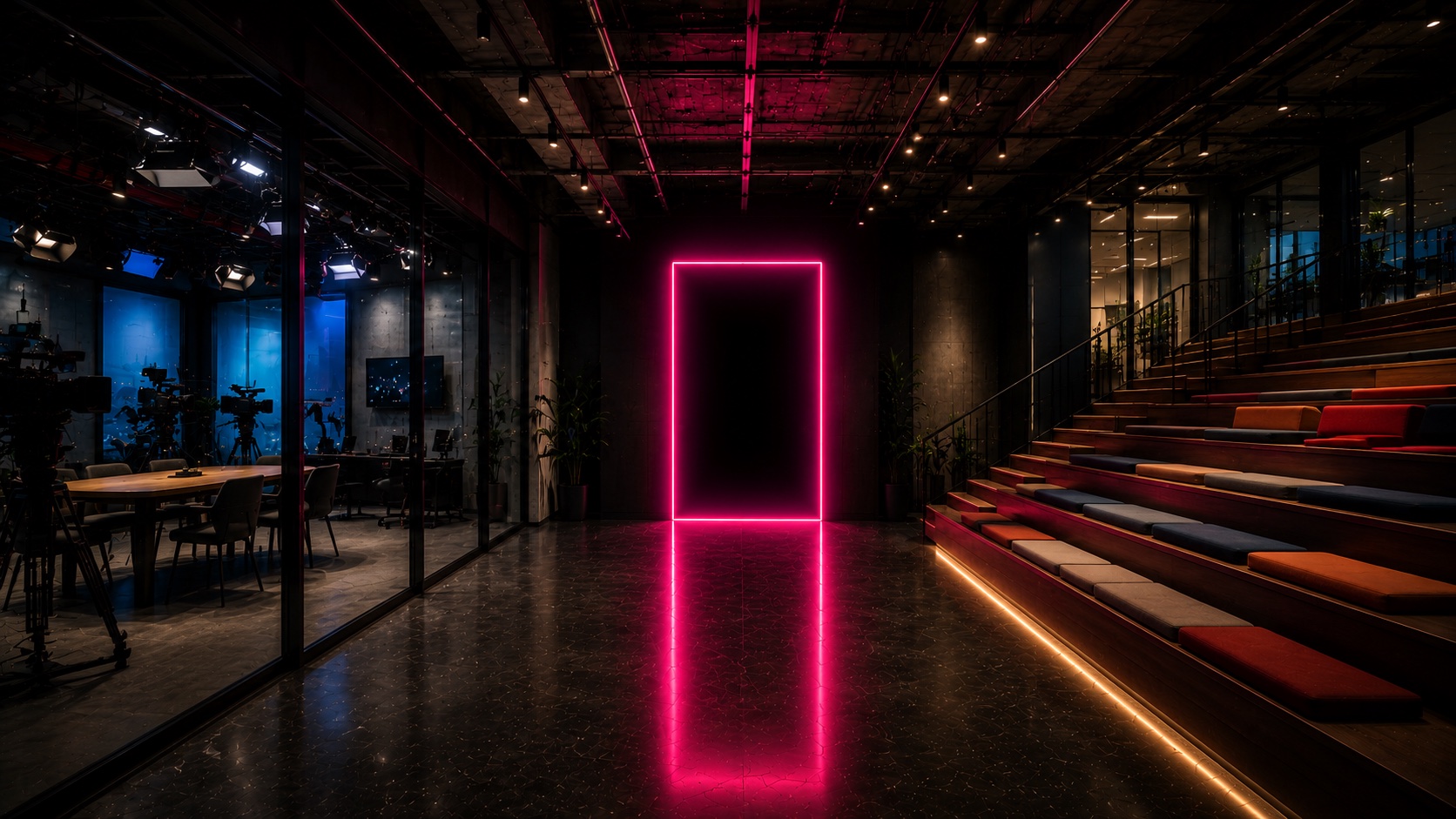
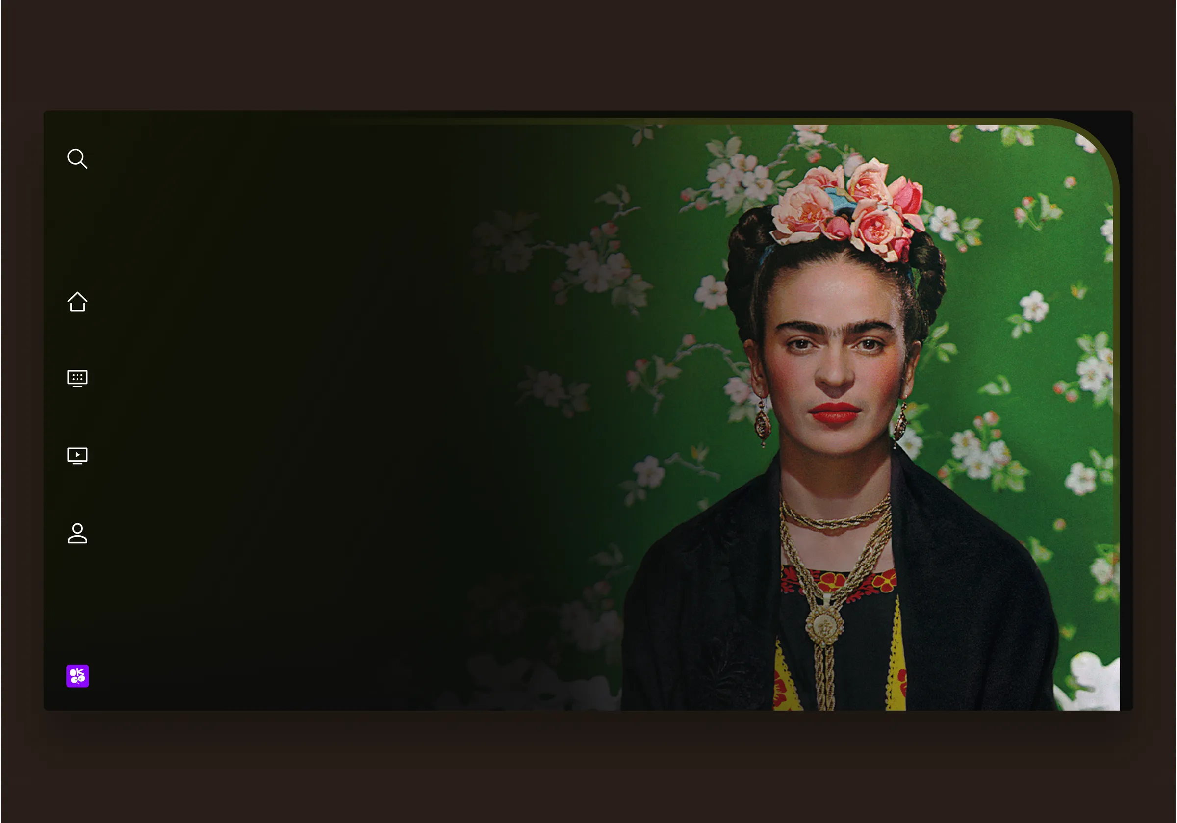
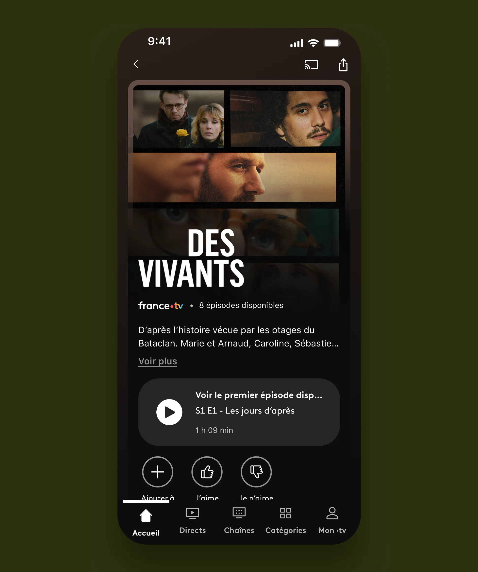
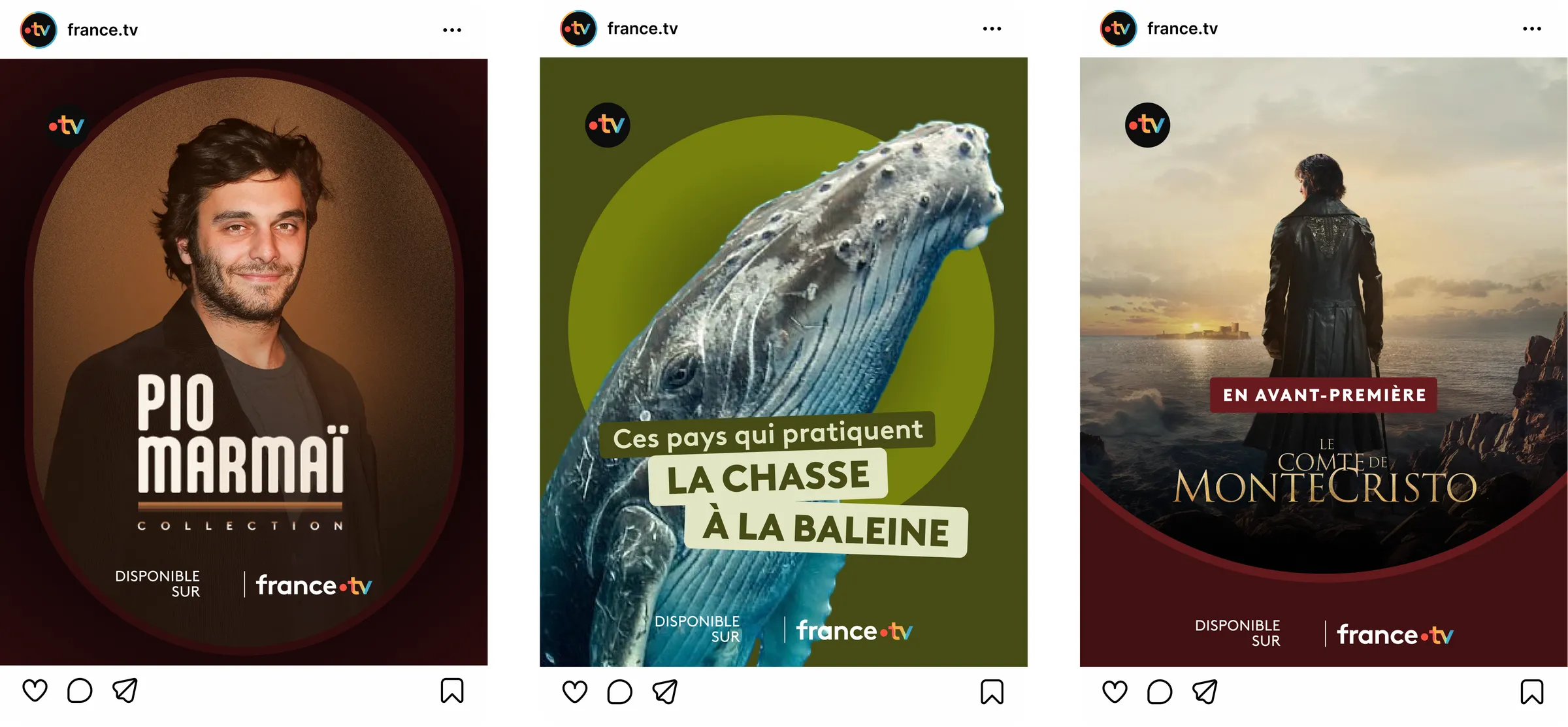
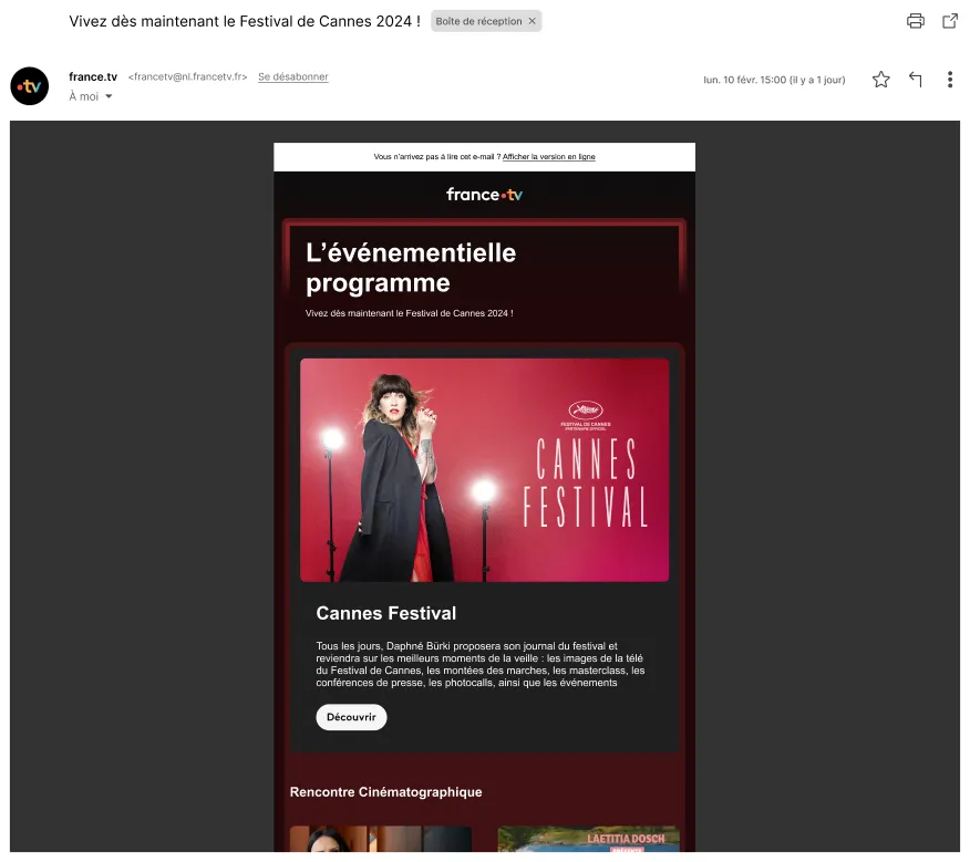
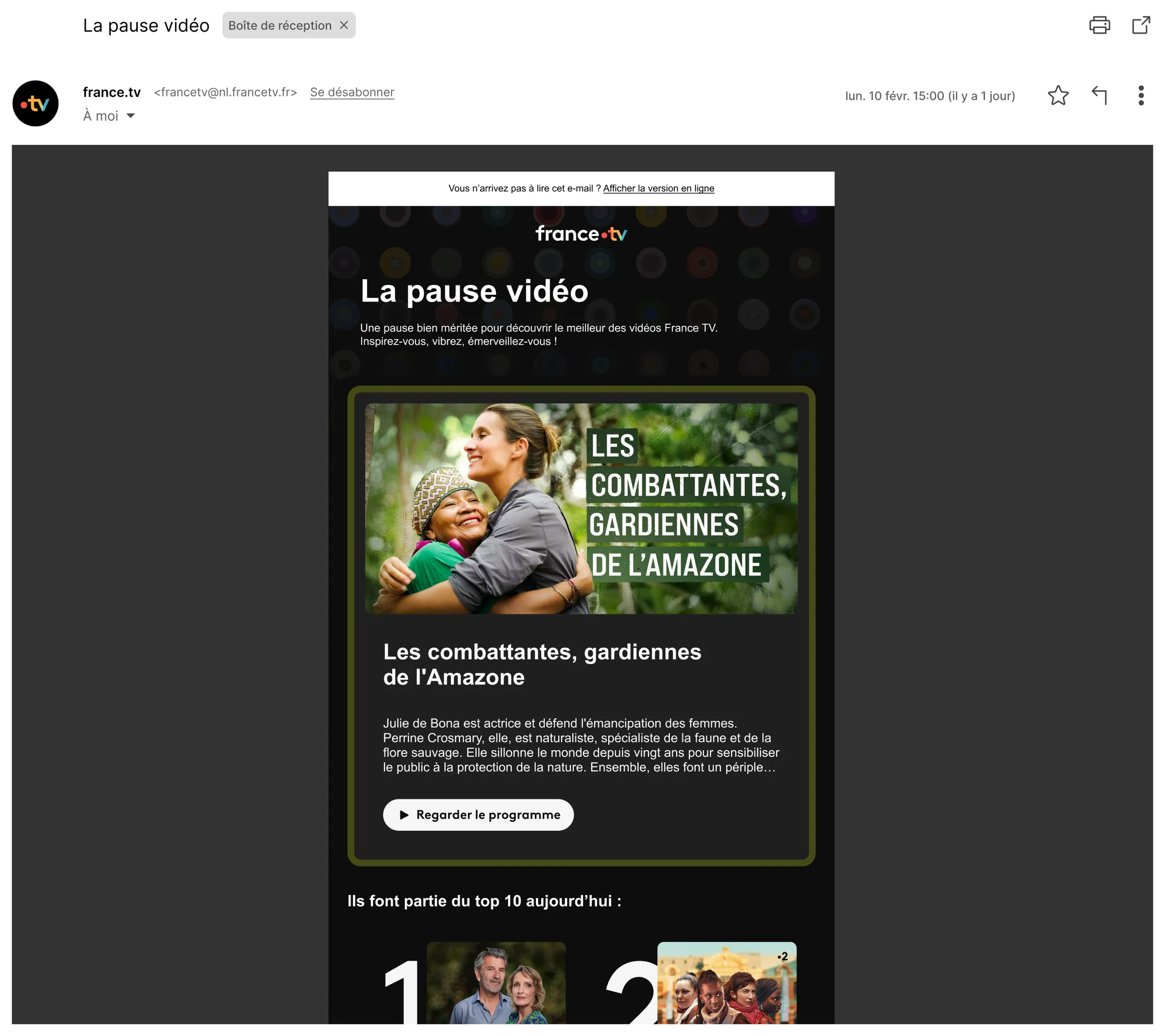
Rather than imposing a single aesthetic, we created a modular framework flexible enough to serve a 24-hour news channel — all while remaining unmistakably France TV.
We defined spatial and narrative territories for each surface.
The work didn't stop at design files. We ran workshops with internal teams across editorial, product, and marketing to ensure the identity could be owned and applied consistently at scale — without us in the room.

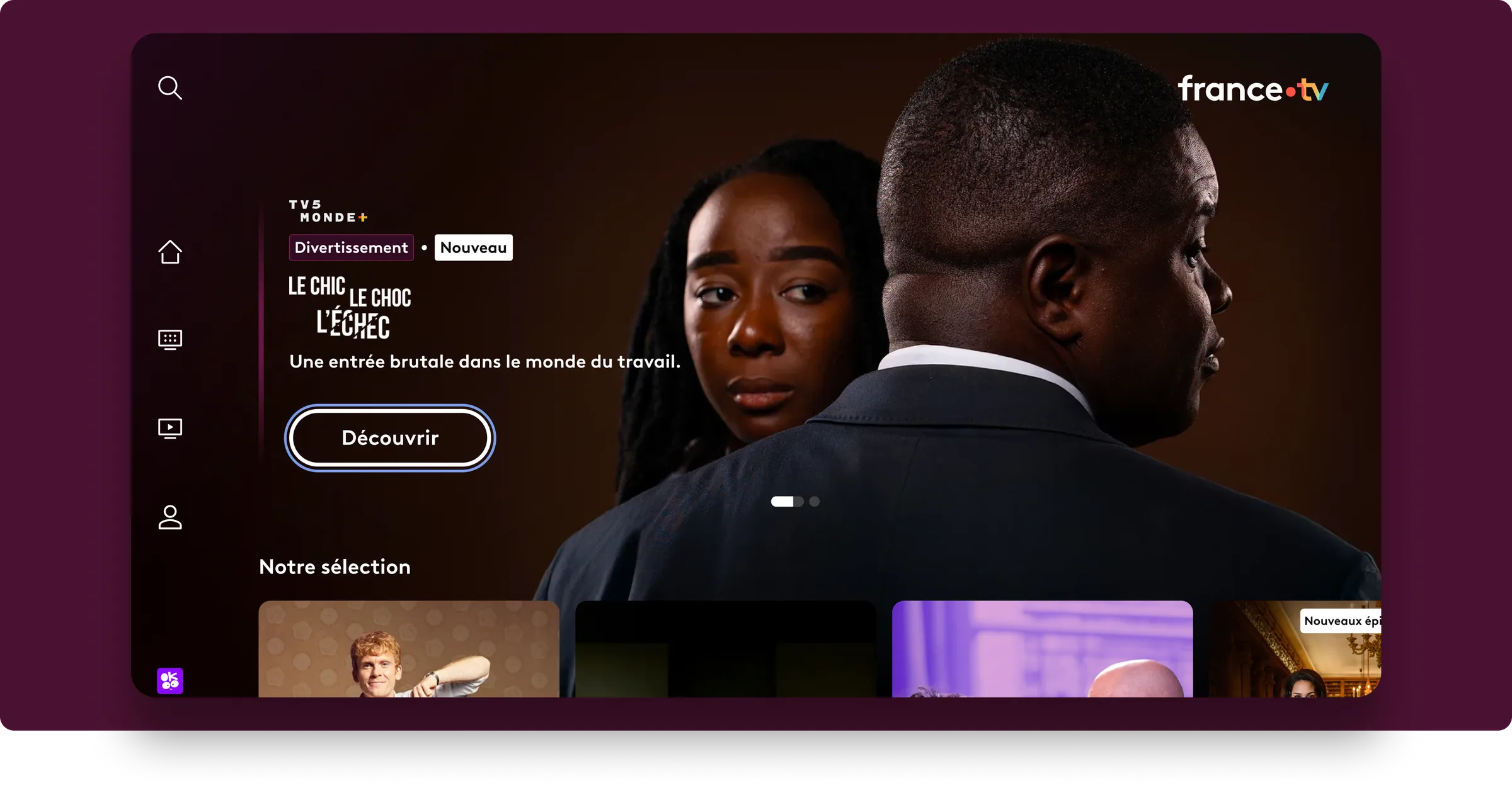
A seamless and powerful digital identity, positioning France TV as a modern and accessible public benchmark.
We started with a thorough audit of France TV's existing digital presence — its product, its communication channels, its design system, and the competitive landscape. Streaming platforms have set a new visual standard. We had to understand exactly where France TV stood, and where it needed to go.
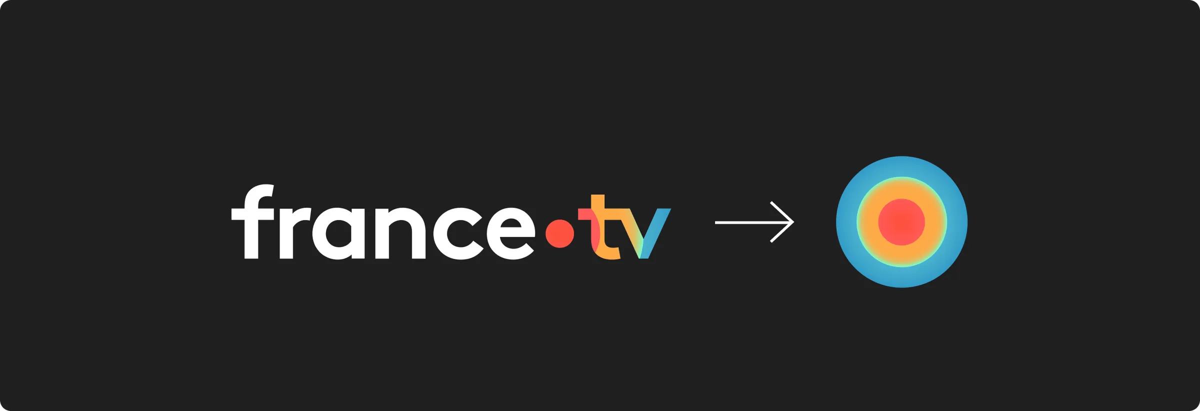
From there, we developed several art direction concepts, each grounded in the group's existing assets but pushed toward a stronger, more distinctive expression. The multidot — present in every channel's logo — became our foundation. It wasn't a constraint. It was the answer.
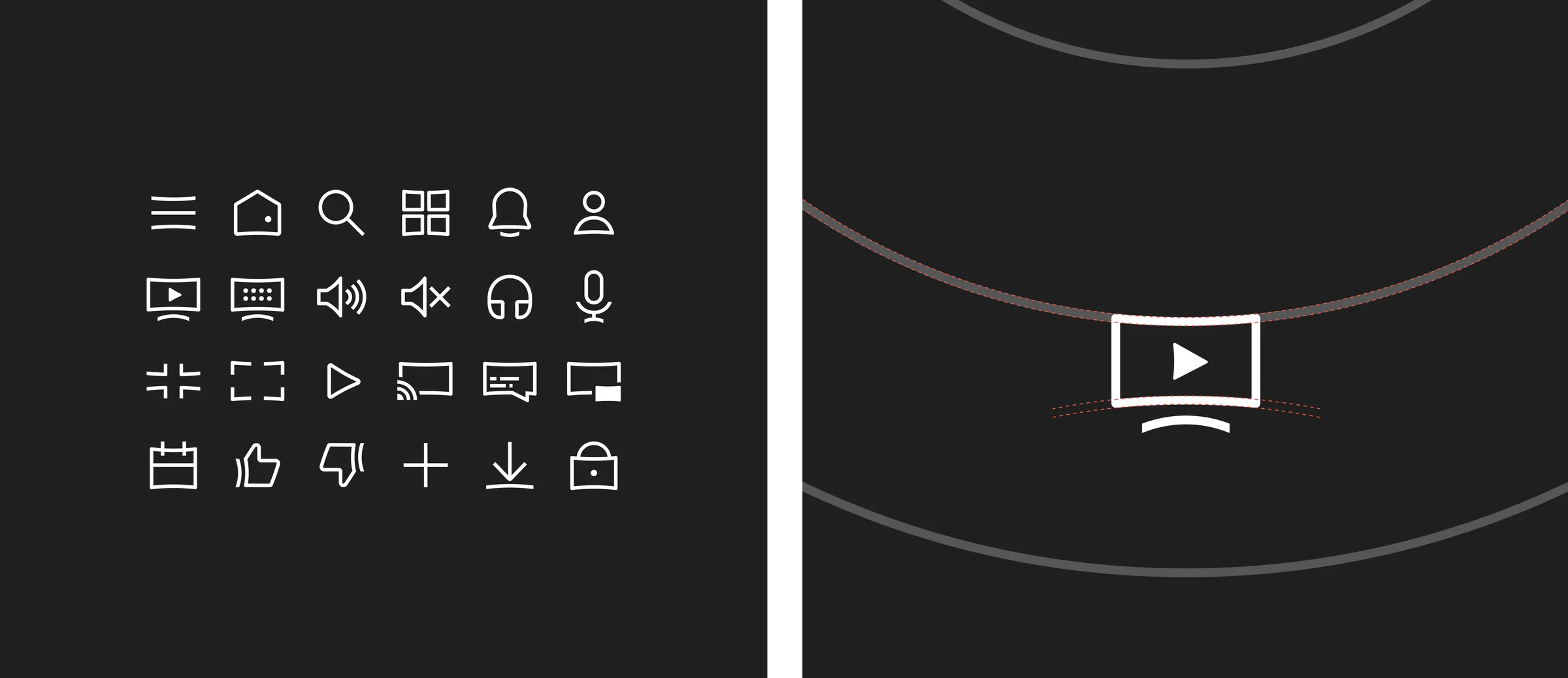
We designed the full visual language: grid systems, typographic hierarchy, color territories, motion principles, and iconographic logic. Everything was built to be modular — usable by a news editor at 6am and a social media manager at 10pm, without losing coherence.
The final phase was about transmission. We ran workshops with internal design, product, editorial, and marketing teams. We wrote the guidelines. We made sure the identity could live without us — applied correctly, consistently, and with confidence across every surface it would touch.

[By the numbers]
[Testimonial]
This dot symbolizes France Télévisions. It creates a connection between the group's different brands, unifying them around a shared system. The goal is to bring more style with a simpler, more modern, and more impactful visual identity.